Practice with prompts that feel closer to the real test.
Choose from 107 IELTS Writing prompts, filter by task type and category, then move into a timed writing session with AI feedback.
Best workflow
Pick a prompt that matches your current weak area.
Write under task-appropriate time pressure.
Review the result and repeat with the next essay.
107 questions
Genetically engineered crops are used in agriculture. Discuss the advantages and disadvantages.
Reality TV shows are a major form of entertainment. Do the advantages outweigh the disadvantages?
The use of artificial intelligence in workplaces is increasing. Do the advantages of this outweigh the disadvantages?
Online shopping has become more popular than traditional shopping. Discuss the advantages and disadvantages.
Studying abroad is a common choice for students. Do the advantages outweigh the disadvantages?
Renewable energy sources like solar and wind are being adopted widely. Discuss the advantages and disadvantages.
Social networking sites are integral to modern communication. Do the advantages outweigh the disadvantages?
Electric vehicles are replacing traditional cars. Discuss the advantages and disadvantages of this shift.
Working remotely has gained popularity post-pandemic. Do the advantages outweigh the disadvantages?
In many countries, people are moving from rural areas to cities. Discuss the advantages and disadvantages of this trend.

The bar chart below illustrates five different industries' percentage share of Brazil's economy in 2009 and 2019 with a forecast for 2029. Summarise the information by selecting and reporting the main features, and make comparisons where relevant.

The bar charts below show the percentages of men and women in employment in three countries in 2005 and 2015. Summarise the information by selecting and reporting the main features, and make comparisons where relevant.

The bar chart shows the number of visitors to three London Museums between 2007 and 2012. Summarise the information by selecting and reporting the main features, and make comparisons where relevant.

The graph gives information about the age of the population of Iceland between 1990 and 2020. Summarise the information by selecting and reporting the main features, and make comparisons where relevant.

The chart gives information on the percentage of women going into higher education in five countries for the years 1980 and 2015. Summarise the information by selecting and reporting the main features, and make comparisons where relevant.

The bar charts below give information on road transport in a number of European countries. Summarise the information by selecting and reporting the main features, and make comparisons where relevant.

The chart shows the percentage of male and female teachers in six different types of educational setting in the UK in 2010. Summarise the information by selecting and reporting the main features, and make comparisons where relevant.

The bar chart shows shares of expenditures for five major categories in the United States, Canada, the United Kingdom, and Japan in the year 2009. Summarise the information by selecting and reporting the main features, and make comparisons where relevant.

The bar chart gives information about the percentage of the population living in urban areas in different parts of the world. Summarise the information by selecting and reporting the main features, and make comparisons where relevant.

The bar chart below shows employment figures in different tourism-related industries between 2009 and 2019. Summarise the information by selecting and reporting the main features, and make comparisons where relevant.

The chart below gives information about global population percentages and distribution of wealth by region. Summarise the information by selecting and reporting the main features, and make comparisons where relevant.
People debate if longer prison sentences deter crime more effectively than rehabilitation programs. Discuss both views and give your own opinion.
Some people think that online education is as effective as traditional classroom learning, while others disagree. Discuss both views and give your own opinion.
Many believe that economic growth is the key to a country's success, whereas others prioritize environmental protection. Discuss both views and give your own opinion.
Some argue that children should have unrestricted access to the internet, while others think it should be strictly controlled. Discuss both views and give your own opinion.
People are divided on whether governments should fund the arts or focus on healthcare and education. Discuss both views and give your own opinion.
Some feel that immigration brings cultural benefits to host countries, while others see it as a strain on resources. Discuss both views and give your own opinion.
There is debate over whether technology makes life easier or more complicated. Discuss both views and give your own opinion.
Some believe that banning junk food advertising would reduce obesity, while others think it infringes on freedom. Discuss both views and give your own opinion.
Opinions differ on whether nuclear energy is a safe alternative to fossil fuels or too risky. Discuss both views and give your own opinion.
Some argue that tourism boosts local economies, while others say it harms the environment. Discuss both views and give your own opinion.

The graph shows waste recycling rates in the U.S. from 1960 to 2011. Summarise the information by selecting and reporting the main features, and make comparisons where relevant.

The graph shows average annual expenditures on cell phone and residential phone services between 2001 and 2010. Summarise the information by selecting and reporting the main features, and make comparisons where relevant.

The graph gives information about changes in the birth and death rates in New Zealand between 1901 and 2101. Summarise the information by selecting and reporting the main features, and make comparisons where relevant.

The graph shows how elderly people in the United States spent their free time between 1980 and 2010. Summarise the information by selecting and reporting the main features, and make comparisons where relevant.

The graph shows population figures for India and China since the year 2000 and predicted population growth up until 2050. Summarise the information by selecting and reporting the main features, and make comparisons where relevant.

The graph shows relative price changes for fresh fruits and vegetables, sugars and sweets, and carbonated drinks between 1978 and 2009. Summarise the information by selecting and reporting the main features, and make comparisons where relevant.

The graph shows the number of books read by men and women at Burnaby Public Library from 2011 to 2014. Summarise the information by selecting and reporting the main features, and make comparisons where relevant.

The graph shows the changes in food consumption by Chinese people between 1985 and 2010. Summarise the information by selecting and reporting the main features, and make comparisons where relevant.

The graph gives information from Annual Energy Outlook 2008 about consumption of energy in the USA since 1980 with projection until 2030. Summarise the information by selecting and reporting the main features, and make comparisons where relevant.

The graph gives information about international tourist arrivals in five countries. Summarise the information by selecting and reporting the main features, and make comparisons where relevant.

The graph shows the population change between 1940 and 2000 in three different counties in the U.S. state of Oregon. Summarise the information by selecting and reporting the main features, and make comparisons where relevant.

The maps below show the changes that have taken place at Queen Mary Hospital since its construction in 1960. Summarise the information by selecting and reporting the main features, and make comparisons where relevant.

The maps below show changes in the city of Nelson in recent times. Summarise the information by selecting and reporting the main features, and make comparisons where relevant.

The maps show improvements that have been made to a university campus between 2010 and the present day. Summarise the information by selecting and reporting the main features, and make comparisons where relevant.

The maps below show the town of Langley in 1910 and 1950. Summarise the information by selecting and reporting the main features, and make comparisons where relevant.

The map below is of the town of Canterbury. A new school (S) is planned for the area. The map shows two possible sites for the school. Summarise the information by selecting and reporting the main features, and make comparisons where relevant.

The map below is of the town of Garlsdon. A new supermarket (S) is planned for the town. The map shows two possible sites for the supermarket. Summarise the information by selecting and reporting the main features, and make comparisons where relevant.

The diagrams below show the changes that have taken place at West Park Secondary School since its construction in 1950. Summarise the information by selecting and reporting the main features, and make comparisons where relevant.
Some argue that genetically modified foods are essential to solve global hunger. To what extent do you agree or disagree?
Many think that social media has more negative impacts on society than positive ones. To what extent do you agree or disagree?
It is argued that children should be taught financial management in schools. To what extent do you agree or disagree?
Some people believe that governments should invest more in public transportation rather than building new roads. To what extent do you agree or disagree?
Some believe that space exploration is a waste of resources that could be better spent on Earth. To what extent do you agree or disagree?
It is often said that advertising encourages unnecessary consumerism. To what extent do you agree or disagree?
People argue that working from home increases productivity for employees. To what extent do you agree or disagree?
Some claim that animal testing for medical research should be banned entirely. To what extent do you agree or disagree?
It is believed that universities should prioritize practical skills over theoretical knowledge. To what extent do you agree or disagree?
Many feel that the death penalty is an effective deterrent to serious crimes. To what extent do you agree or disagree?

The pie charts give information about world population in 1900 and 2000. Summarise the information by selecting and reporting the main features, and make comparisons where relevant.

The pie charts compare ways of accessing the news in Canada and Australia. Summarise the information by selecting and reporting the main features, and make comparisons where relevant.

The chart below shows the proportions of graduates from Brighton University in 2019 entering different employment sectors. Summarise the information by selecting and reporting the main features, and make comparisons where relevant.

The pie charts below show the devices people in the 18 to 25 age group use to watch television in Canada in two different years. Summarise the information by selecting and reporting the main features, and make comparisons where relevant.

The charts below show local government expenditure in 2010 and 2015. Summarise the information by selecting and reporting the main features, and make comparisons where relevant.

The pie charts show electricity generation by source in New Zealand and Germany in 1980 and 2010. Summarise the information by selecting and reporting the main features, and make comparisons where relevant.

The pie charts below show the most common advantages and disadvantages of Bowen Island, according to a survey of visitors. Summarise the information by selecting and reporting the main features, and make comparisons where relevant.

The two pie charts show the online shopping sales for retail sectors in Canada in 2005 and 2010. Summarise the information by selecting and reporting the main features, and make comparisons where relevant.

The three pie charts show the changes in annual spending by local authorities in Someland in 1980, 1990 and 2000. Summarise the information by selecting and reporting the main features, and make comparisons where relevant.

The pie charts show the average household expenditures in Japan and Malaysia in the year 2010. Summarise the information by selecting and reporting the main features, and make comparisons where relevant.
The decline in biodiversity is a global issue. Discuss the problems and propose solutions.
Traffic congestion in cities is a growing problem. What are the causes and possible solutions?
Many young people are facing unemployment after graduation. What are the reasons and solutions?
Environmental pollution is affecting urban areas. What are the main causes and how can they be addressed?
Obesity rates are rising among children. Discuss the problems and suggest solutions.
Aging populations are straining healthcare systems. What are the issues and potential solutions?
Plastic waste is harming oceans. Discuss the causes and possible solutions.
Stress levels are high in modern workplaces. What are the main problems and how can they be solved?
Water scarcity is becoming more common in some regions. Identify the causes and suggest solutions.
Cyberbullying is prevalent on social media. What causes this and what measures can be taken?

The diagram shows how a central heating system in a house works. Summarise the information by selecting and reporting the main features, and make comparisons where relevant.

The diagram illustrates how bees produce honey. Summarise the information by selecting and reporting the main features, and make comparisons where relevant.
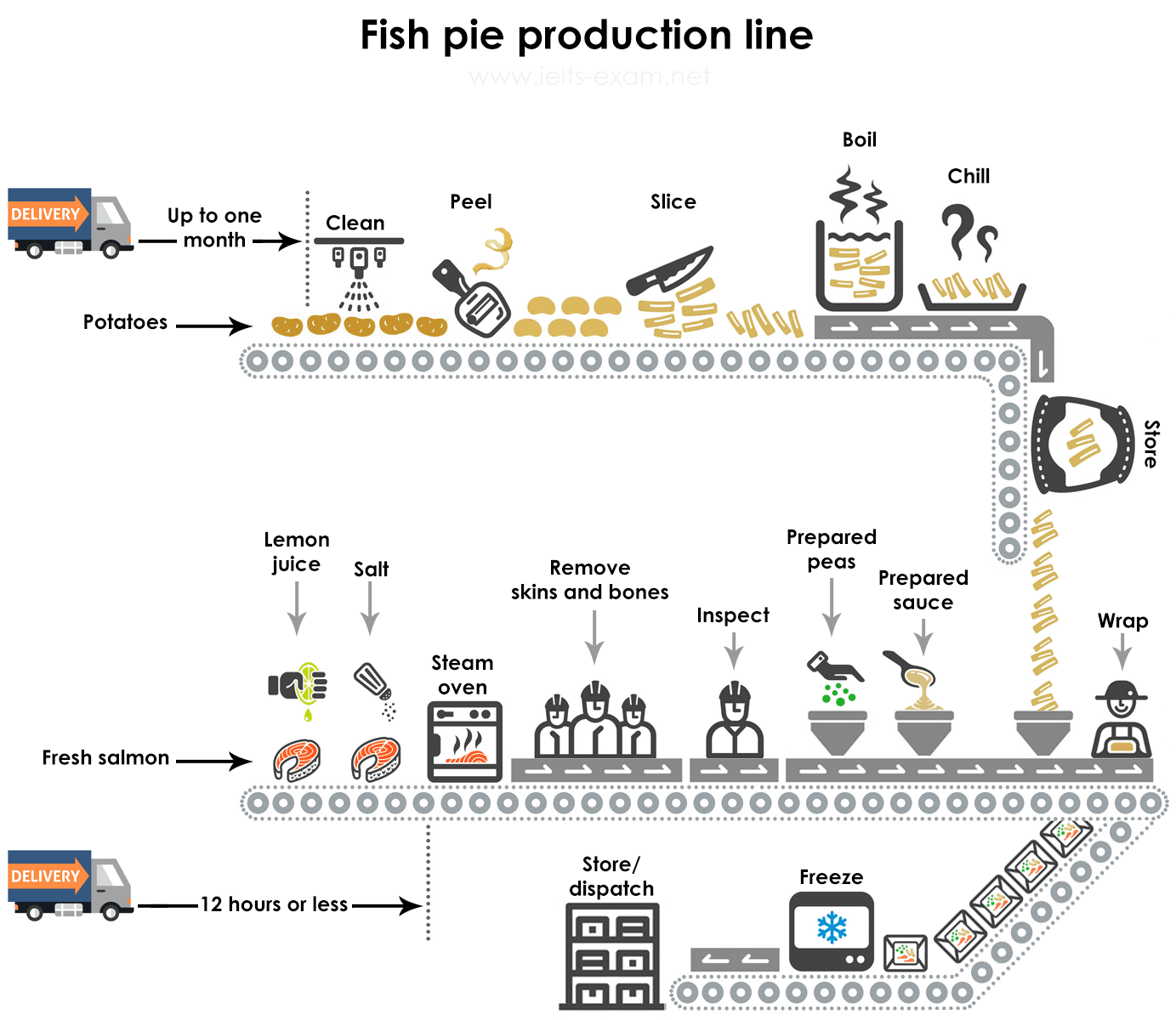
The diagrams give information about the manufacture of frozen fish pies. Summarise the information by selecting and reporting the main features, and make comparisons where relevant.

The diagram shows the recycling process of aluminium cans. Summarise the information by selecting and reporting the main features, and make comparisons where relevant.

The diagram shows a possible future means of home energy production. Summarise the information by selecting and reporting the main features, and make comparisons where relevant.

The diagram shows the production of electricity using a system called Ocean Thermal Energy Conversion (OTEC). Summarise the information by selecting and reporting the main features, and make comparisons where relevant.

The diagrams show a structure that is used to generate electricity from wave power. Summarise the information by selecting and reporting the main features, and make comparisons where relevant.

The diagram shows the production of steam using a gas cooled nuclear reactor. Summarise the information by selecting and reporting the main features, and make comparisons where relevant.

The diagram shows how greenhouse gases trap energy from the Sun. Summarise the information by selecting and reporting the main features, and make comparisons where relevant.

The diagram shows the typical stages of consumer goods manufacturing, including feedback mechanisms. Summarise the information by selecting and reporting the main features, and make comparisons where relevant.

The table below shows sales of Fairtrade-labelled tea and pineapples in 2010 and 2015 in five European countries. Summarise the information by selecting and reporting the main features, and make comparisons where relevant.

The table below shows the number of medals won by the top five countries in the Summer Olympic Games. Summarise the information by selecting and reporting the main features, and make comparisons where relevant.

The table below shows the average band scores for students from different language groups taking the IELTS Academic test. Summarise the information by selecting and reporting the main features, and make comparisons where relevant.

The table below shows the monthly expenditure of an average Australian family in 2010. Summarise the information by selecting and reporting the main features, and make comparisons where relevant.

The table below gives information about the underground railway systems in six cities. Summarise the information by selecting and reporting the main features, and make comparisons where relevant.

The table below shows the number of languages with the most native speakers. Summarise the information by selecting and reporting the main features, and make comparisons where relevant.

The table below shows a restaurant's average sales in three different branches in 2016, 2017 and 2018. Summarise the information by selecting and reporting the main features, and make comparisons where relevant.

The table below shows cinema viewing figures for films by country, in millions. Summarise the information by selecting and reporting the main features, and make comparisons where relevant.
How does culture influence education systems? Should schools promote multiculturalism more?
What causes stress in teenagers? What role can parents play in alleviating it?
How has technology changed the way we communicate? Is this change positive or negative overall?
Why is recycling important for the environment? How can governments promote better recycling habits?
What are the main reasons for global warming? What steps can individuals take to reduce it?
Why is physical education important in schools? How can schools improve their sports programs?
What are the benefits of learning a second language? How can it be made easier for adults?
How has fast food affected health worldwide? What measures can be taken to promote healthier eating?